
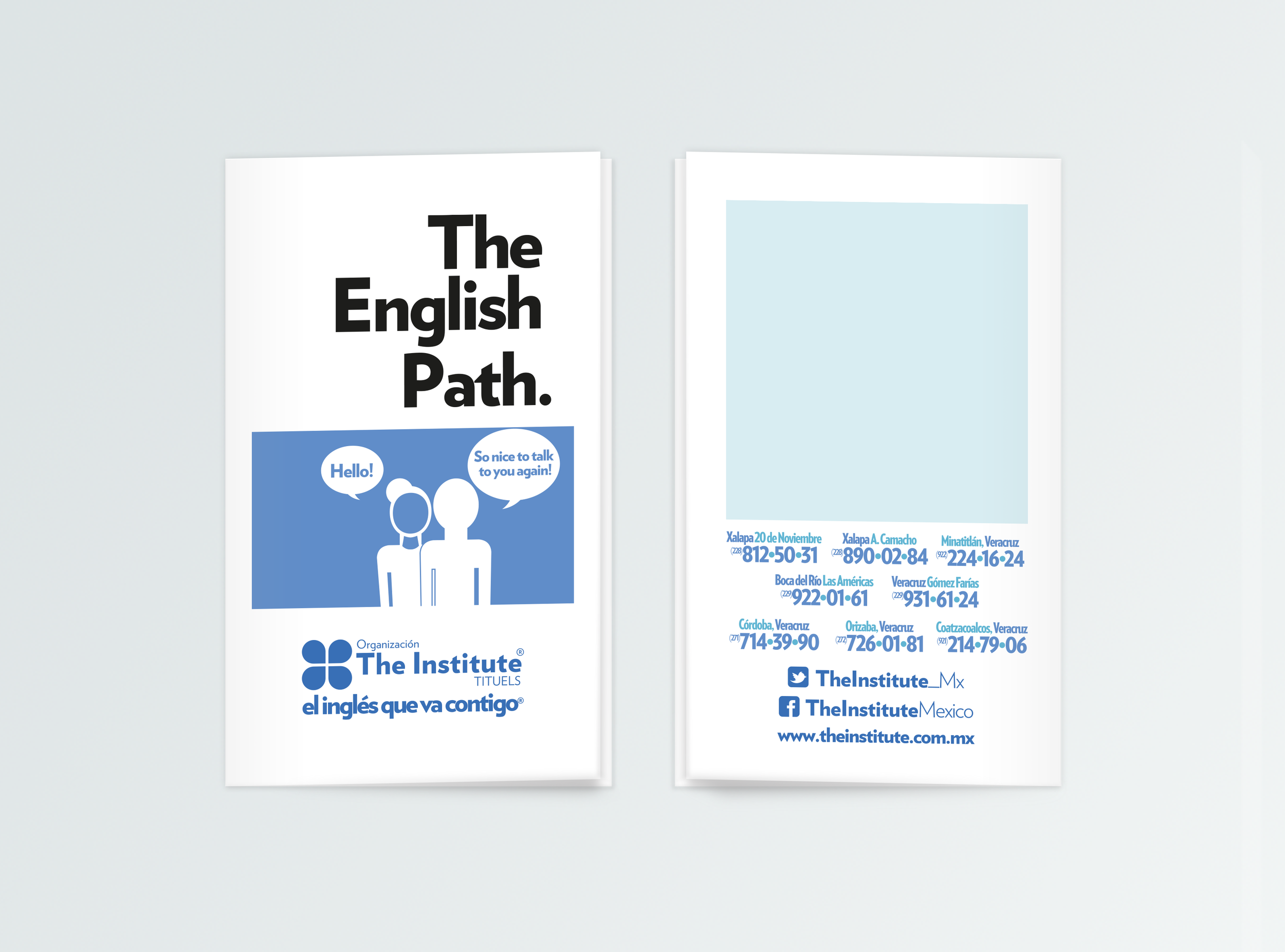
The English Path
Branding an academic program. Project: The Institute wanted to re-brand their academic program on a way that the students could identify their goals and achievements as they they go through each course. The concept relies on different visual scenarios on how a student interaction can become more and more fulfilling as it continues through this English Path, from a basic level to Proficiency. This Design has been inspired on the beautiful Isotypes by Gerd Arntz.
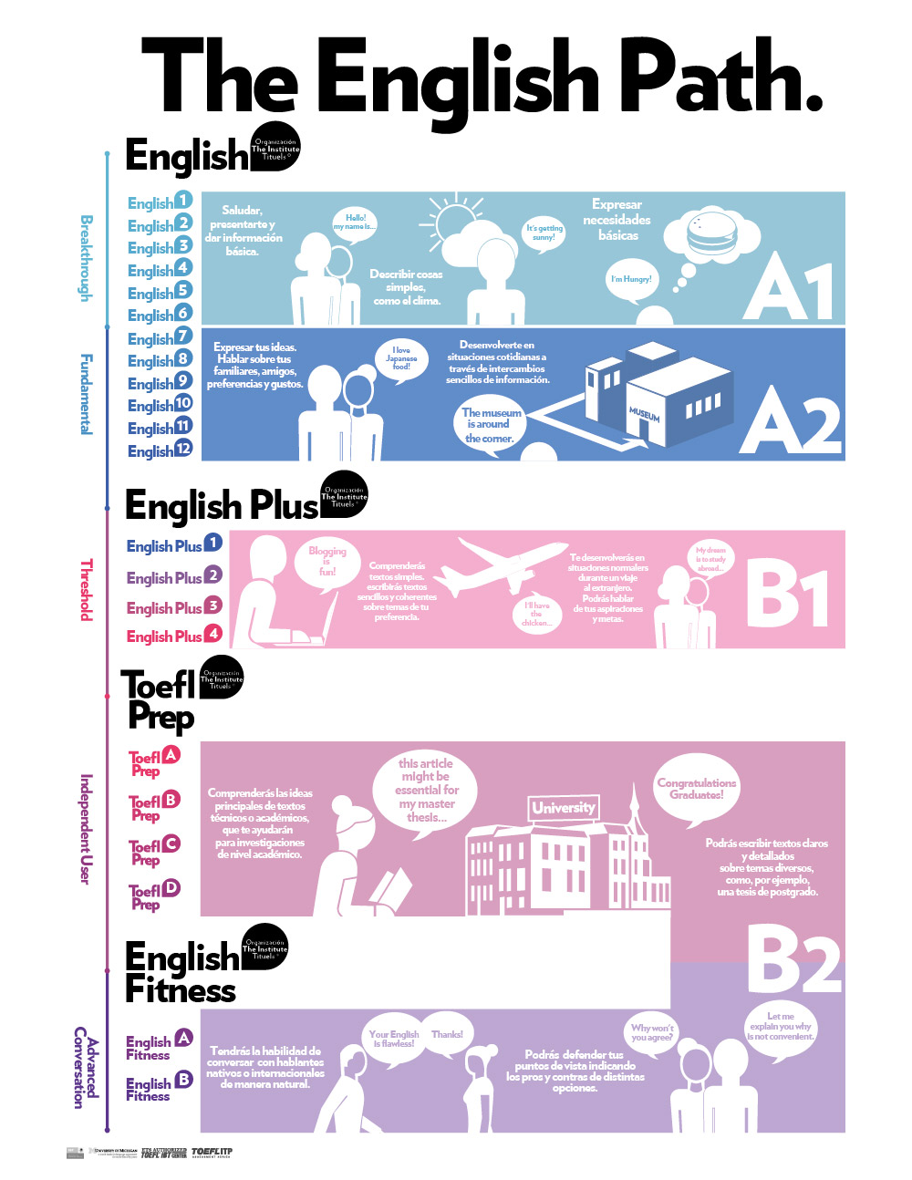
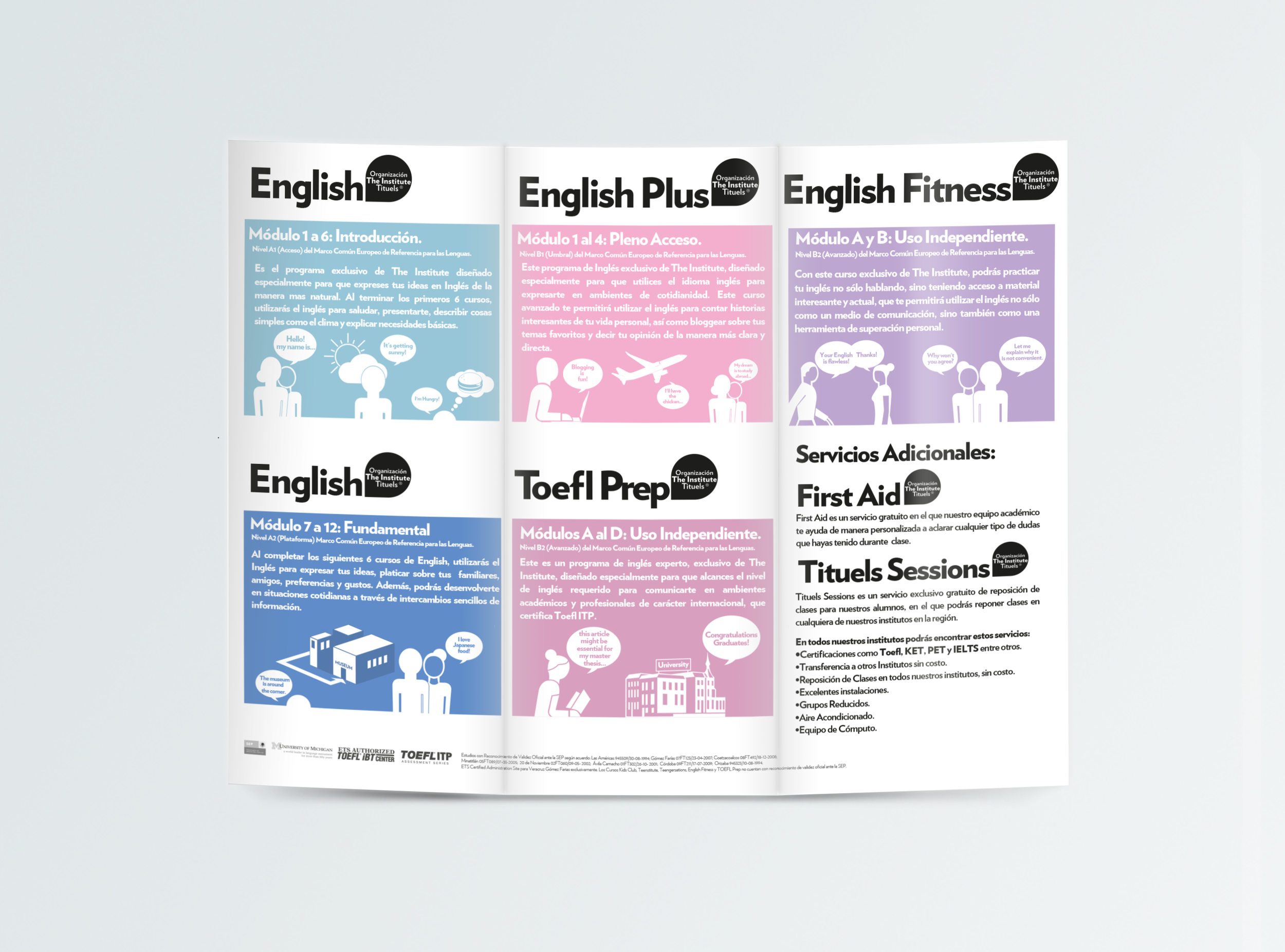
Graphic Design: José de la O
Client: Organización The Institute TITUELS.